If your product is solid but new users keep dropping off, SaaS MVP onboarding design is usually where the fastest wins live. Great onboarding is not about adding more screens. It is about getting people to value quickly, with less confusion and fewer choices.
Table of Contents
What “the aha moment” really is (and why it matters)
In SaaS, the “aha moment” is the first time a new user feels: “This solves my problem.”
It is often one of these moments:
- They successfully import data and see it organised.
- They complete a workflow and receive a useful result.
- They generate a report that answers a real question.
- They automate a task that used to be manual.
The job of SaaS MVP onboarding design is to reduce the time between “signed up” and “got value”. The fewer steps it takes to reach that moment, the more likely users are to stick around.
A useful mental model: onboarding is not a tour. It is a guided path to the first meaningful outcome.
SaaS MVP onboarding design vs product growth hacks
It is tempting to patch churn with popups, tooltips, and clever emails. Those can help, but they are not a substitute for product clarity.
Good SaaS MVP onboarding design usually fixes:
- Unclear positioning (users do not know what the product is for)
- Too many first-run choices
- A blank dashboard with no direction
- Too much setup before any payoff
- Missing “what next” prompts after the first action
If you are building or refining your app experience, VVRapid’s App Design & Development service is the natural home for this work.
The MVP onboarding goal: one outcome, one path
Before you change screens, define one thing:
What is the first outcome a successful new user should achieve within 10 minutes?
Examples:
- “Create and send the first invoice”
- “Connect one data source and see the dashboard”
- “Create one project and assign the first task”
- “Publish the first listing”
- “Generate the first quote”
In SaaS MVP onboarding design, you can absolutely support multiple user types, but your MVP should still have one primary path. Secondary paths can come later.
Quick activation checklist
Use this list to sanity-check your current onboarding.
- A new user can see what to do next within 10 seconds
- There is a single primary call to action on the first screen
- Setup steps are grouped and clearly progress-tracked
- The product shows value before asking for too much information
- Users can recover from mistakes without fear
- The dashboard is not empty, or it explains how to populate it
- The first email supports the next action, not a generic welcome
If you cannot tick at least 5, onboarding is likely costing you growth.
Map the first session journey (simple, effective)
Here is a practical way to map onboarding without overthinking it.
- Entry: How do they arrive? Search, referral, sales demo, ad, social
- Expectation: What do they think they will get?
- First screen: What do they see first?
- First action: What is the first meaningful click?
- First value: What output proves value?
- Next step: What should they do next to build habit?
Write it on one page. If you cannot describe it in one page, the journey is too complex for an MVP.
This is also where a short Digital Strategy Roadmap helps, because it forces clarity around the product promise and the first-use scenario.
The 6 onboarding elements most SaaS MVPs need (and when to skip them)
You do not need all six. But most successful MVPs include a few of these in some form.
1) A welcome screen that confirms the promise
One screen. One sentence.
Example structure:
- “You are in the right place if you want to _________.”
- Primary button: “Do _________ now.”
Skip it if your first screen already makes the promise obvious.
2) A short segmentation question
Segmentation helps you route users to the right path:
- “What are you here to do?” with 2 to 4 options
- Or “Which role best describes you?”
Keep it light. Avoid long forms.
Skip it if your audience is narrow and the path is basically the same for everyone.
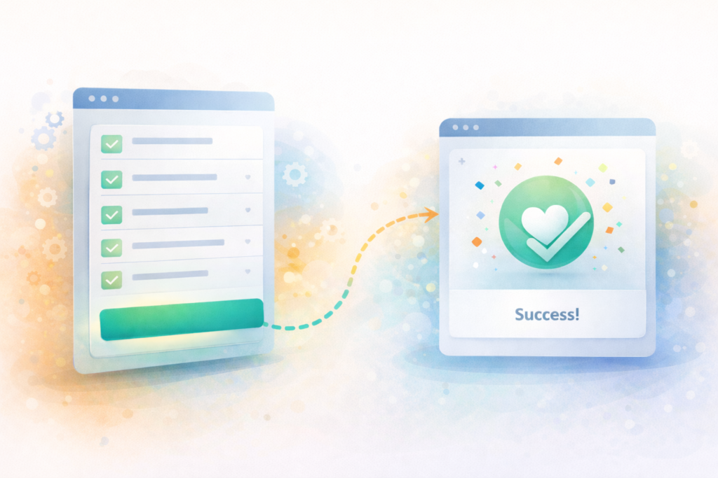
3) A setup checklist with progress
Checklists work because they reduce uncertainty:
- Connect X
- Create Y
- Invite Z
- Do first task
Make the checklist visible until complete.
Skip it if your product reaches value in one step.
4) A guided “first task” flow
This is the heart of SaaS MVP onboarding design.
Examples:
- Create a project
- Add a customer
- Build a template
- Import a file
- Set up an automation
This flow should be opinionated. Less choice, more guidance.
5) Empty states that teach
Empty states are not blank.
They should include:
- What this area does
- Why it matters
- A primary action to populate it
- Optional: “See an example” or “Use sample data”
Skip it only if you never show empty screens.
6) First success celebration and next step
Do not overdo it. But do mark progress:
- “Nice. Your first report is ready.”
- “Next: schedule this weekly.”
Small confirmations reduce drop-off.
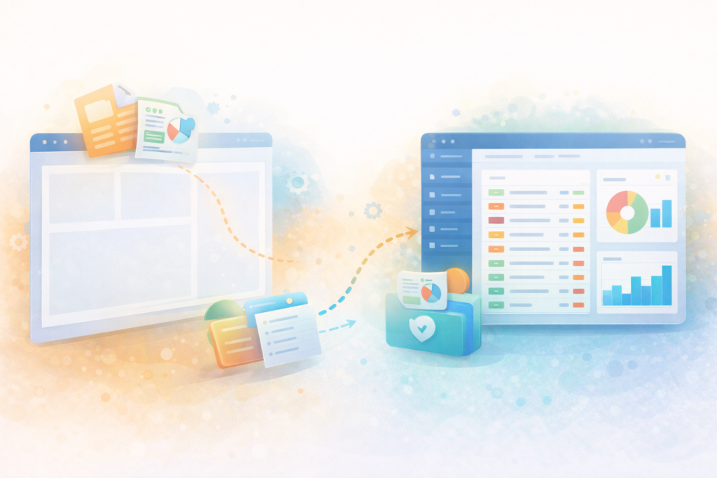
The silent killer: empty dashboards
A blank dashboard makes users feel like they did something wrong.
Strong SaaS MVP onboarding design solves this with one of these approaches:
- Sample data mode: show realistic demo content that users can replace
- Template-first: pre-built templates that create immediate structure
- Wizard completion screen: after setup, route them directly to the next action
- Contextual CTAs: a dashboard card that says “Import your first file” or “Create your first project”
If you do one thing this month, fix your empty states.
Templates, sample data, and “training wheels”
Many founders resist sample data because it feels fake. In practice, it is often the difference between “I get it” and “I am lost”.
Use sample data when:
- Your product depends on data volume to look useful
- Users need to learn patterns, not just buttons
- The value is clearer with examples
Use templates when:
- Your product is workflow-based
- Most customers start similarly
- You want to reduce setup decisions
A good compromise: let users choose “Start with a template” or “Start from scratch”. Default to the template option.
Instrumentation: what to track from day one
You do not need a complex analytics stack to improve onboarding. You do need to measure the first session.
Track events tied to your “aha moment”:
- Sign-up completed
- Email verified (if required)
- Setup step completed (integration connected, import done)
- First core object created (project, invoice, listing, automation)
- First successful output (report generated, message sent, task completed)
- Invite sent (if team product)
- Second session within 7 days
A reputable reference for product analytics thinking:
Keep it simple: if you can answer “where do most people stop?” you can improve.
SaaS MVP onboarding design patterns that usually work
Here are patterns that tend to improve activation without bloating the product.
Make the first action unavoidable (in a good way)
Your first screen should have one dominant action.
Bad: 6 equally weighted buttons.
Better: 1 primary CTA, with secondary options tucked away.
Reduce typing
Use defaults:
- Pre-filled names
- Smart suggestions
- “Skip for now” where possible
Delay advanced settings
Advanced settings are for later sessions. MVP onboarding should focus on value.
Use progressive disclosure
Show only what users need now. Unlock complexity as they progress.
Give users control without making them choose everything
Offer a recommended path:
- “Recommended setup (3 minutes)”
- “Custom setup”
Emails and in-app notifications that support activation
Onboarding is not only in-product. But your messaging should reinforce the next step, not distract.
Good onboarding email #1:
- Reminds them what the product does
- Includes a single deep link back to the next action
- Offers help if they are stuck
Good in-app notifications:
- Confirm progress
- Prompt one next action
- Avoid constant interruptions
A solid external reference on UX writing and microcopy:
Common mistakes in SaaS MVP onboarding design
Mistake 1: Treating onboarding like a feature tour
Tours teach buttons. Users need outcomes.
Fix: Design the first task flow around a real job-to-be-done.
Mistake 2: Asking for everything upfront
Long forms kill momentum.
Fix: Ask only what you need to deliver the first output.
Mistake 3: Too many paths in the MVP
Choice creates friction.
Fix: One primary path. Support other paths later.
Mistake 4: No recovery when users make mistakes
If mistakes feel risky, users hesitate.
Fix: Add undo, confirmations, drafts, and safe defaults.
Mistake 5: Ignoring mobile and small screens
Even B2B SaaS is often opened on a phone.
Fix: Ensure onboarding is responsive and readable.
Mistake 6: Shipping onboarding but not maintaining it
Onboarding is a living system.
Fix: Build a feedback loop, monitor drop-offs, and iterate. For ongoing support, VVRapid’s Website Maintenance & Care is relevant for keeping web products stable and updated.
A practical “first-week onboarding” sequence you can copy
Here is a lean sequence that works for many MVPs.
Day 0: In-product
- Welcome and promise confirmation
- One segmentation question (optional)
- Setup checklist (3 to 5 items)
- Guided first task flow
- Success confirmation and next action
Day 1: Email
- “Your next best step” with deep link to continue setup
- Short help note: 3 common stuck points
Day 3: In-product nudge
- Show checklist progress and benefits of completion
- Offer template or sample data if empty
Day 7: Email
- Quick recap of value
- One suggested workflow to build habit
- Ask one question: “What stopped you?”
When it is time to redesign onboarding (signals)
You likely need onboarding work if:
- Many users sign up but few complete the first core action
- Support tickets are mostly “how do I start?”
- Users do not understand key terms
- Customers churn before the first billing cycle
- Your sales team says “people love the demo but struggle alone”
This is classic SaaS MVP onboarding design territory. Small changes can have outsized impact.
FAQ
What is SaaS MVP onboarding design?
SaaS MVP onboarding design is the first-run experience that helps new users reach a meaningful outcome quickly, with minimal setup and clear next steps.
What is the “aha moment” in SaaS onboarding?
It is the first time a user experiences real value, like completing a core task or seeing a useful output, and thinking “this solves my problem.”
How do you reduce drop-off during onboarding?
Reduce choices, shorten setup, guide users through one first task, and improve empty states with templates or sample data so users always know what to do next.
What should you track to improve onboarding?
Track activation events like first core action completed, first output generated, invite sent (if relevant), and whether users return within 7 days.
How VVRapid can help
If you are building a SaaS MVP or improving activation, VVRapid can help you map the first session journey, design a clear onboarding path, and implement the flows with clean UI and analytics hooks. Start with App Design & Development and pair it with a Digital Strategy Roadmap when positioning and user paths need clarification.
Next step: pick your “aha moment” and design backwards
Choose the one outcome you want new users to reach fast. Then remove steps until it feels almost too simple. That is usually the right direction.
For help designing and building the flow, view the service page: App Design & Development
External (reputable sources):