Website and UX guidance for small businesses doesn’t have to be complicated. If your site loads fast, feels obvious to navigate, and makes the next step clear, you’re already ahead of most competitors.
Your visitors are busy. They’re often on mobile. And they’re usually comparing you with two or three alternatives, right now.
Table of Contents
Website and UX guidance for small businesses: the “Fast, Clear, Easy” framework
When you strip away the jargon, most small business websites succeed or fail on three things:
- Fast: pages load quickly and feel smooth (especially on mobile data)
- Clear: your offer is understandable in seconds
- Easy: navigation, forms, and actions don’t create friction
This Website and UX guidance for small businesses post is built around those three pillars, with practical fixes you can apply whether you’re DIY-ing on WordPress or hiring a team.
Start with the job your website must do
Before layout and colours, answer one question:
What action should a visitor take within the next 30 seconds?
For most small businesses, it’s one of these:
- Request a quote
- Book a call / appointment
- Call or WhatsApp
- Buy a product
- Visit a location
- Download something (price list, brochure, menu)
Good Website and UX guidance for small businesses always starts here, because the “right design” depends on the job.
Think: If your website had to earn its keep with only one page, what would that page need to achieve?
The small-business site structure that works (and stays fast)
A common mistake is building too many pages too early. More pages = more upkeep, more chances for confusing navigation, and more content that goes stale.
A lean, high-performing structure usually includes:
The essential pages (most businesses)
- Home (a clear overview + trust + next step)
- Services (what you do, who it’s for, outcomes, process)
- About (why you, proof, credibility, values)
- Contact (multiple contact options + simple form)
Add these when needed
- Pricing / Packages (if you can share ranges or starting points)
- FAQ (answer objections and reduce repetitive enquiries)
- Portfolio / Case examples (show proof of capability)
- Blog (if organic traffic and authority matter long-term)
- Store (if you sell products)
If you’re mapping Website and UX guidance for small businesses onto your own site, this is the first upgrade: remove pages that don’t support a clear action.
If you need help tightening structure and UX, see Website Design & Development.
Layout that’s easy to scan (and doesn’t overwhelm)
People don’t read websites, they scan. Your job is to make scanning feel effortless.
A simple, conversion-friendly page layout
Use this structure for Home and Services pages:
- Hero section
- One clear headline: what you do + for who
- One supporting line: outcome or differentiator
- One primary CTA (button)
- Optional: a secondary CTA (link)
- Problem → solution
- 3–5 bullets: pains you solve, benefits, or “we help you…”
- Services / offers
- 3–6 cards with short descriptions (link to service detail if needed)
- Proof
- logos, testimonials, ratings, certifications, or outcomes you can honestly claim
- (No proof? Use “process” and “what to expect” instead.)
- How it works
- Step 1 / Step 2 / Step 3
- FAQ
- answer pricing, timelines, what you need from the client, and common concerns
- Final CTA
- repeat the primary action
This Website and UX guidance for small businesses approach reduces decision fatigue: the visitor always knows where they are and what to do next.
Micro-layout rules that instantly improve UX
- Keep paragraphs 2–4 lines max
- Use meaningful H2/H3 headings (not vague ones like “Welcome”)
- Use bullets for features, steps, and requirements
- Add generous spacing (white space is clarity)
- Put your main CTA above the fold and again near the bottom
Navigation that never makes people think
Navigation is where small business sites often lose money… quietly.
Website navigation best practices
- Keep top menu items to 5–7 max
- Use labels visitors expect:
- “Services” (not “Solutions”)
- “Pricing” (not “Investment”)
- “Contact” (not “Let’s Talk”)
- Make your logo link back to Home
- Add a clear CTA button in the header (e.g., “Get a Quote”)
- Ensure the mobile menu is thumb-friendly and not cramped
If you’re applying Website and UX guidance for small businesses, the simplest test is this:
Can a new visitor find your Services and Contact in under 5 secondsvon mobile?
Mobile-first design: what to fix first
Most small business traffic is mobile-heavy, and mobile users are less patient with slow load times and fiddly layouts.
Mobile quick wins (15 minutes each)
- Increase body text size (generally 16px+)
- Use large tap targets for buttons and links
- Keep forms short (name, email/phone, message)
- Avoid huge hero images that push content down
- Don’t use tiny multi-column layouts, stack them cleanly
Mobile-first Website and UX guidance for small businesses also means speed-first (more on that next), because many mobile users aren’t on perfect Wi-Fi.
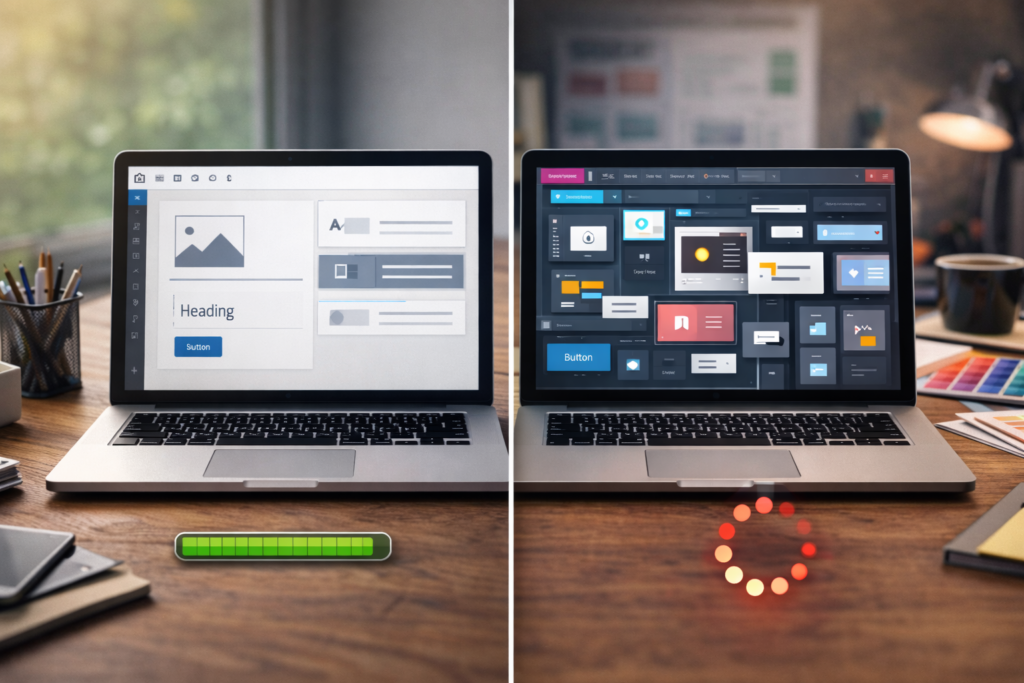
Speed-first UX: the performance basics that matter
Speed is user experience. A fast site feels more trustworthy, more professional, and easier to use.
The biggest speed killers on small business sites
- Oversized images (especially hero banners)
- Too many plugins and scripts
- Heavy page builders used without performance discipline
- Cheap hosting that struggles under load
- No caching strategy
Speed improvements with the biggest ROI
- Compress and resize images (use modern formats where possible)
- Limit plugins to the essentials
- Use caching and a performance-friendly stack
- Clean up fonts and unnecessary animations
If you want Website and UX guidance for small businesses that’s practical: start by improving only the pages that get the most traffic (usually Home, Services, and Contact).
External tool link (speed testing): : Google PageSpeed Insights ↗
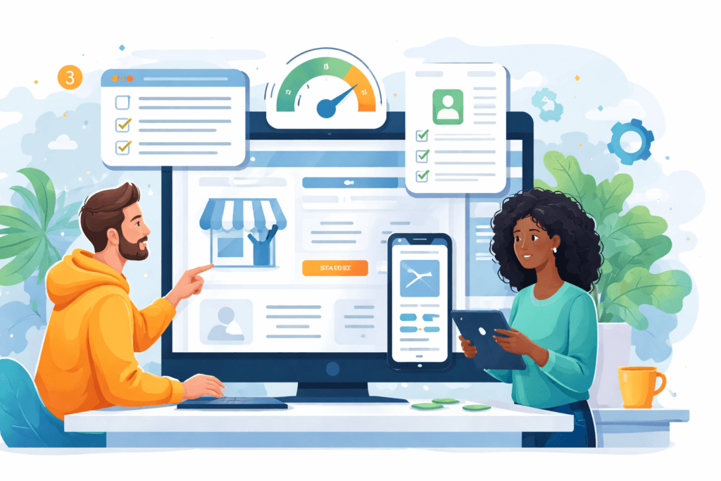
Conversion-focused pages: what each page must include
Website and UX guidance for small businesses shouldn’t just make your site “pretty.” It should help visitors take action.
Home page: clarity + trust + direction
Your homepage should answer:
- What do you do?
- Who do you do it for?
- Why should I trust you?
- What should I do next?
Must-haves:
- a headline that says what you do (not a vague slogan)
- one primary CTA above the fold
- proof elements (or a clear process if proof is limited)
- quick links to your key services
Services page: outcomes, not fluff
Avoid a services page that’s just a list. Visitors want:
- what they get
- what problem it solves
- how it works
- what it roughly costs (even ranges help)
- what you need from them to start
If you can’t publish exact prices, you can still share starting-from or typical project ranges (label them as illustrative; pricing varies by scope and region).
Contact page: reduce friction to near zero
Your contact page should feel like a relief, not a barrier.
Must-haves:
- multiple contact options (form + email + phone/WhatsApp if relevant)
- simple form (don’t ask 12 questions)
- what happens after they submit (timeframe + next step)
- a map and hours if you’re location-based
This is Website and UX guidance for small businesses in action: make contacting you the easiest part of their day.
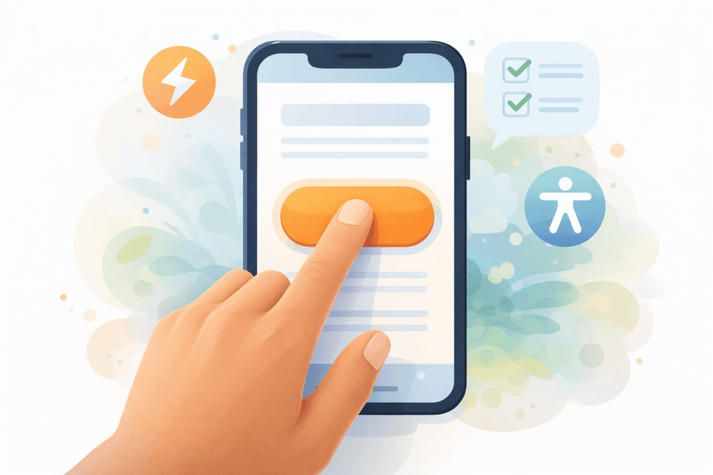
Website accessibility basics (that also improve usability for everyone)
Accessibility isn’t just for large organisations. It’s basic good UX, and it helps a wider range of users complete tasks.
The most useful accessibility improvements
- Ensure strong colour contrast for text and buttons
- Use descriptive link text (not “click here”)
- Add labels for form fields
- Use headings in the correct order (H2 → H3)
- Make sure your site can be navigated by keyboard
- Add alt text to meaningful images (not decorative ones)
External accessibility standard: WCAG 2.2 (W3C) ↗
External quick tool: WebAIM Contrast Checker ↗
The “fix these first” checklist (high-impact website improvements)
Use this Website and UX guidance for small businesses checklist as a quick audit.
Clarity
- ☐ Your headline says what you do + who it’s for
- ☐ One primary CTA is visible without scrolling
- ☐ Services are explained in simple language
- ☐ Each page has one main goal (not five)
Navigation
- ☐ Menu has 5–7 items max
- ☐ Contact is always easy to find
- ☐ The logo links to Home
- ☐ Mobile menu is easy to tap
Mobile UX
- ☐ Text is readable (16px+)
- ☐ Buttons are easy to tap
- ☐ Layout stacks cleanly (no tiny columns)
- ☐ Forms are short and usable on mobile
Speed & performance
- ☐ Images are compressed and correctly sized
- ☐ You aren’t using 25 plugins “just because”
- ☐ Caching is configured properly
- ☐ Hosting matches your site’s needs (especially for ecommerce)
Conversion
- ☐ Proof exists (testimonials, reviews, examples, process)
- ☐ You explain “what happens next” after a form submission
- ☐ Contact options match your customers (call, email, WhatsApp, booking)
- ☐ Key pages answer common objections
If you only do five items today, start with: headline, CTA, contact friction, image sizes, and mobile readability.
Common mistakes that make small business websites feel “off”
Here are the issues we see most often when Website and UX guidance for small businesses is missing:
- Trying to impress instead of trying to be understood
Clever copy often reduces clarity. - Too many CTAs on one page
One page, one job. Support it. - Navigation built for the business, not the visitor
Visitors don’t care about internal department names. - Heavy design choices that slow the site down
Your site shouldn’t feel like it’s loading a movie. - Forms that ask for everything upfront
Start the conversation first. Details can come later. - No trust signals
Even a simple “How it works” section builds confidence if testimonials are limited. - Mobile-first web design treated as an afterthought
Mobile is often the majority experience.
DIY vs hire: a simple decision guide
Website and UX guidance for small businesses should also help you decide when to get help.
DIY might be fine if…
- You have a simple offer (1–3 core services)
- You can write clear copy and keep it updated
- You’re comfortable learning WordPress basics
- You don’t need advanced integrations
Hire a team if…
- Your site is your main lead source (or should be)
- You need ecommerce, payments, booking, or custom forms
- You’re rebranding or replacing an outdated site
- Speed, SEO, and technical setup need to be handled properly
If you’re comparing budgets, remember: pricing varies by scope and region. What matters is whether the build supports the outcomes you need.
What a small business website can cost (realistic context)
Based on VVRapid’s current website packages in USD (or ZAR), you can broadly map spend to complexity:
- Starter Small Business Website Package (up to 3 unique pages): $250 – $350 (R3 945 – R5 546)
- Standard Business Website with Ecommerce (up to 6 unique pages + up to 20 products): $500 – $700 (R7 907 – R11 060)
- Premium Business Website Package (up to 12 unique pages + up to 50 products): $900 – $1 200 (R14 229 – R18 983)
These ranges are useful for planning, but always treat them as starting context – pricing varies by scope, region, content readiness, and integrations.
How VVRapid can help (without overcomplicating it)
If you want a site that loads fast, feels clear, and is easy to use, VVRapid’s Website Design & Development team focuses on practical small business website UX and real-world performance. That includes mobile-first web design layouts, speed optimisation, clean structure, and launch support. If you also need visibility, LLM SEO and content can be layered in so the website doesn’t just “exist” – it gets found and converts consistently.
FAQ: Website and UX guidance for small businesses
How many pages does a small business website need?
Most small businesses do well with 3–6 core pages (Home, Services, About, Contact, plus optional Pricing/FAQ). Add pages only when they support a clear visitor goal.
What’s the quickest UX improvement I can make?
Rewrite your headline for clarity and add one primary CTA above the fold. Then simplify your contact form.
Do I need a blog for my small business website?
Only if you plan to publish consistently and use it to build organic traffic and authority. Otherwise, focus on your core pages first.
What’s more important: design or speed?
Both matter, but speed is part of UX. A beautiful site that loads slowly often loses visitors before they see the design.
Is accessibility only for large companies?
No. Accessibility basics (contrast, labels, readable text, keyboard navigation) improve usability for everyone and reduce friction.
If you want help applying this Website and UX guidance for small businesses to your own site (or rebuilding with speed-first UX), explore VVRapid’s web services or request a web quote.