Website navigation best practices help small business websites make every important page, service, product, and call to action easier for visitors to find.
Table of Contents
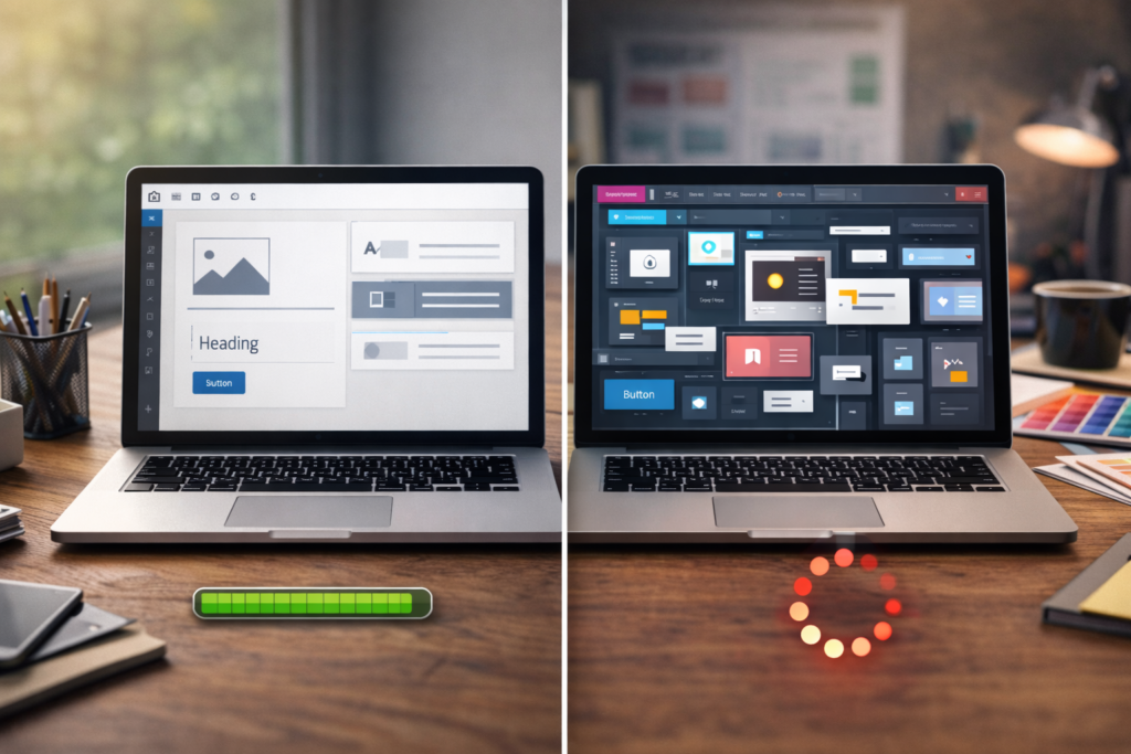
Navigation is not just the menu at the top of your website. It is the full system that helps someone understand where they are, where they can go next, and how to take action without feeling lost.
Think: if people have to work too hard to find something, many will not keep trying.
For a small business, clear navigation can improve enquiries, bookings, sales, trust, and website usability. It can also support SEO by helping search engines and users understand how your pages connect.
Why website navigation best practices matter
A small business website often has limited time to earn attention.
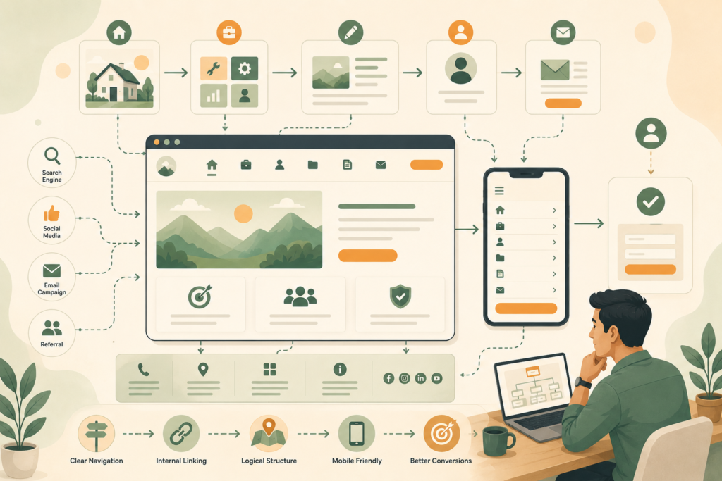
Visitors may arrive from Google, social media, an email link, a paid ad, or a referral. They may land on your homepage, but they may also enter through a blog post, service page, product page, or location page.
Good navigation helps them answer simple questions:
- What does this business offer?
- Is this relevant to me?
- Where can I find the service or product I need?
- Can I trust this business?
- What should I do next?
Poor navigation creates friction. Visitors may click around, get confused, miss important pages, or leave.
That is why website navigation best practices are not just a design concern. They are part of conversion, SEO, accessibility, and customer experience.
Nielsen Norman Group notes that people rely on menus to find content and use features, and recommends that menus should be easy to find, understand, and use.: Nielsen Norman Group menu design checklist ↗
Website navigation best practices for small business websites
The best navigation is usually simple, predictable, and focused.
A small business website does not need to show every page in the top menu. It needs to show the pages that help visitors make progress.
Start with this principle: your navigation should match the customer journey, not your internal filing system.
A visitor does not care how your business is organised behind the scenes. They care about finding the right service, understanding whether you can help, checking trust signals, and taking the next step.
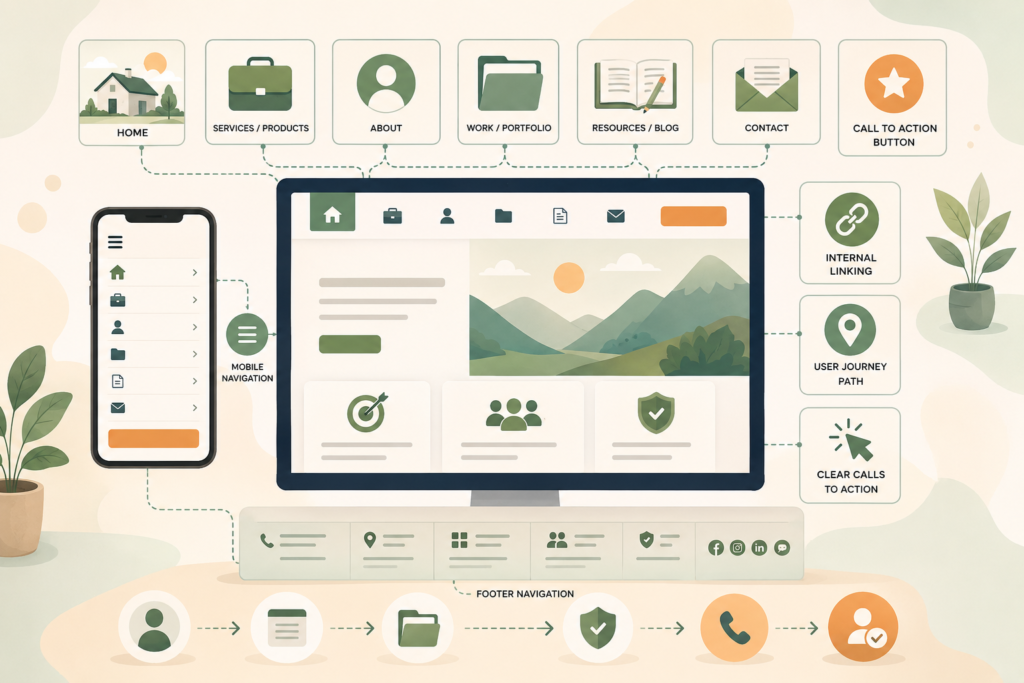
For most small business websites, the main menu should include:
- Home
- Services or Products
- About
- Work, Case Studies, or Portfolio, if relevant
- Resources or Blog, if useful
- Contact
- A clear call-to-action button
The exact wording depends on your business model. A local service provider, ecommerce brand, consultant, hospitality business, and app-based service will all need slightly different website menu design.
A clear website design and development process can help turn messy page ideas into a navigation structure visitors can actually use.
What belongs in your main menu?
Your main menu should highlight the pages that matter most to new and returning visitors.
For many small businesses, that means fewer links, not more.
A crowded menu can make every option feel less important. A short menu helps people scan faster and choose with more confidence.
Home
Some websites include “Home” in the menu. Others rely on the logo linking to the homepage.
Either approach can work, but make sure the logo always links home. This is a familiar pattern and helps visitors recover if they get lost.
Services or Products
This is usually one of the most important links.
If you offer several services, avoid hiding them under vague wording. “Services” is often clearer than “Solutions” or “What We Do”.
If your services are very different, use a dropdown carefully. Make sure it is easy to use on desktop and mobile.
About
People often visit the About page when they are deciding whether to trust a business.
The About page does not need to be the most prominent item, but it should be easy to find.
Work, Portfolio, or Case Studies
Use this if proof matters in your buying journey.
For designers, builders, consultants, agencies, coaches, developers, and professional services, examples can help visitors understand your quality and fit.
Do not call this page something clever if clarity matters more. “Our Work” is often better than a vague branded phrase.
Blog or Resources
A blog can support SEO and education, but it does not always need to dominate the main menu.
If content is part of your strategy, include Blog, Resources, Insights, or Guides. Pick the label your audience will understand fastest.
Helpful blog and article writing can support navigation by giving visitors useful next steps from service pages, FAQs, and educational content.
Contact
Make Contact easy to find.
For service businesses, this is often a primary conversion path. The contact link should not be buried in a dropdown.
Call-to-action button
A CTA button can sit in the header if there is one clear next step.
Examples include:
- Book a Call
- Get a Quote
- Start a Project
- Request Pricing
- Schedule a Demo
- Contact Us
Do not use too many competing buttons. If everything is urgent, nothing is.
Keep menu labels clear
Menu labels are not the place to be mysterious.
Clear labels improve small business website UX because visitors can make quick decisions. They also support accessibility and search understanding.
Good labels are specific and familiar:
- Services
- Pricing
- About
- Contact
- Blog
- Locations
- Portfolio
- Support
- FAQs
Weaker labels may include:
- Discover
- Explore
- Experience
- Possibilities
- Our World
- Let’s Talk, when used instead of Contact
- What We Believe, when used instead of About
There is nothing wrong with brand personality. But navigation should prioritise clarity.
If a visitor has to click to understand what a menu item means, the label may be too vague.
Plan navigation around the user journey
A user journey is the path someone takes from first landing on your website to taking a meaningful action.
For a small business, common journeys include:
- Visitor finds a service page from Google, then checks About, reviews, and Contact
- Visitor lands on the homepage, compares services, reads FAQs, then requests a quote
- Visitor reads a blog post, clicks through to a related service, then books a call
- Visitor checks pricing, reviews support details, then buys
- Visitor wants your location, opening hours, or phone number quickly
Your navigation should support these paths.
That means important next steps should appear in more than one place. Do not rely only on the top menu. Use internal linking, buttons, footer navigation, related content, breadcrumbs, and clear page sections.
W3C’s accessibility guidance explains that navigable websites should help users find content and understand where they are.: W3C Understanding Guideline 2.4 Navigable ↗
Use dropdown menus carefully
Dropdown menus can be helpful, but they can also become a dumping ground.
Use dropdowns when they make the website easier to scan. Avoid them when they hide the most important pages or create awkward mobile interactions.
A good dropdown menu:
- Has short, clear labels
- Groups related items logically
- Does not include too many links
- Works on touch devices
- Is easy to close
- Does not cover essential content unnecessarily
- Does not require precise mouse movement
- Has enough colour contrast
Nielsen Norman Group recommends putting menus in expected locations and ensuring menu links have enough contrast against the background.
For a service business, a dropdown under Services might include:
- Website Design
- SEO
- Hosting
- Website Maintenance
- Digital Strategy
- Custom Development
For ecommerce, categories may need a larger menu, but structure still matters. Group by how customers shop, not by how your stock system is organised.
Mobile navigation needs special attention
Mobile navigation is not just a smaller version of desktop navigation.
On mobile, people tap with fingers, scroll vertically, use smaller screens, and may be on slower connections. Your mobile menu should be easy to open, read, tap, and close.
Check that:
- The menu icon is easy to find
- The menu opens quickly
- Links are large enough to tap
- Dropdowns work without frustration
- Important CTAs are visible
- The menu does not cover everything awkwardly
- Contact details are easy to access
- Sticky headers do not take up too much space
- The page does not jump when the menu opens
A common small business mistake is hiding the most important conversion action inside a crowded mobile menu. If calls or bookings matter, consider a visible phone link, sticky CTA, or clear Contact button.
For mobile navigation, test on real devices. Browser resizing helps, but it does not fully show how a menu feels in someone’s hand.
Ongoing website maintenance and care can help catch broken menu links, plugin conflicts, mobile layout issues, and navigation problems after updates.
Footer navigation matters more than you think
Many visitors scroll to the footer when they cannot find something.
Footer navigation is useful for secondary links, trust pages, legal pages, service links, support details, and contact information.
A strong footer may include:
- Business name
- Short positioning statement
- Main services
- Contact details
- Location or service area
- Opening hours, if relevant
- Privacy policy
- Terms and conditions
- Social links
- Newsletter signup, if useful
- Blog or resources
- Support links
- Sitemap link, for larger sites
Footer navigation should not become a messy storage area. Group links clearly.
For example:
- Services
- Company
- Resources
- Support
- Legal
This helps visitors scan quickly and supports website structure.
Use internal linking to guide the next click
Internal linking is navigation inside your content.
It helps visitors move from one useful page to another without relying only on the menu. It also helps search engines understand relationships between pages.
Examples include:
- Linking from a blog post to a related service page
- Linking from a service page to an FAQ
- Linking from a pricing page to a comparison guide
- Linking from an About page to a portfolio
- Linking from a case study to a contact page
- Linking from a maintenance page to hosting
Good internal linking is helpful, not forced.
The link should fit the sentence naturally and give the visitor a reason to click.
A practical search engine optimisation review can improve internal linking, page hierarchy, and the way key service pages support each other.
Make calls to action obvious
Navigation should lead somewhere useful.
That is where call-to-action buttons matter.
A good CTA tells people what happens next. It should be specific enough to reduce hesitation.
Examples:
- Get a Website Quote
- Book a Consultation
- Request a Demo
- View Packages
- Start Your SEO Review
- Contact Support
- Download the Guide
Avoid using too many different CTA labels across one page. Consistency helps visitors understand what to do.
Also avoid vague CTAs like “Click Here” or “Submit” when a better option exists.
A form button that says “Request a Quote” is clearer than “Submit”. A header button that says “Book a Call” is clearer than “Let’s Go”.
Website navigation checklist
Use this checklist when reviewing your small business website navigation.
- □ Main menu includes only high-priority links
- □ Menu labels are clear and familiar
- □ Logo links back to the homepage
- □ Contact page is easy to find
- □ Primary CTA is visible and consistent
- □ Service or product pages are grouped logically
- □ Dropdowns are short, usable, and mobile-friendly
- □ Mobile menu opens and closes smoothly
- □ Tap targets are comfortable on mobile
- □ Footer links are grouped clearly
- □ Legal and trust pages are accessible
- □ Internal links guide visitors to related pages
- □ Breadcrumbs are used where helpful
- □ Important pages are no more difficult to find than necessary
- □ Navigation order is consistent across pages
- □ Link text has enough contrast
- □ Broken links are fixed
- □ Calls to action match the user journey
This is a simple checklist, but it catches many common website usability issues.
Common mistakes with website navigation
Using vague labels
Clever labels can confuse visitors.
Use plain words first. Add personality elsewhere.
Adding too many menu items
A long menu can overwhelm people. Prioritise the most important paths.
Hiding important pages
Do not bury high-value pages, such as Services, Contact, Pricing, or Bookings, inside several layers of navigation.
Ignoring mobile navigation
A menu that works on desktop may be frustrating on a phone. Test it properly.
Making the footer an afterthought
Footer navigation helps visitors recover when they cannot find what they need.
Using inconsistent navigation
Repeated navigation should stay predictable. WCAG’s consistent navigation criterion says repeated navigation mechanisms should appear in the same relative order across a set of pages unless the user initiates a change.: WCAG 2.1 Consistent Navigation ↗
Forgetting internal links
Menus are not the only navigation tool. Internal links inside page copy can guide visitors at the exact moment they need the next step.
When should you redesign your navigation?
You may need to revisit your website structure if visitors are not finding important pages or if the site has grown without a clear plan.
Signs include:
- Users ask where to find basic information
- Important pages get very little traffic
- Contact enquiries are low despite decent traffic
- Mobile users drop off quickly
- Service pages are buried
- Blog posts do not connect to commercial pages
- The footer is cluttered
- Menu labels no longer match your offer
- The website has too many disconnected pages
This often happens as small businesses grow. New services, blogs, landing pages, locations, and offers are added over time. Eventually, the original structure no longer fits.
A digital strategy roadmap can help reorganise your website structure around customer journeys, content priorities, SEO opportunities, and future growth.
How VVRapid can help
VVRapid helps small businesses plan and improve websites with practical attention to structure, usability, SEO, content, and performance.
That can include website design and development, navigation reviews, page hierarchy planning, internal linking, content structure, and ongoing maintenance.
The goal is simple.
Make the website easier for customers to understand and easier for the business to grow.
FAQ: website navigation best practices
What are website navigation best practices?
Website navigation best practices are guidelines for helping visitors find pages, understand where they are, and take the next step. They include clear menu labels, simple structure, mobile-friendly menus, useful footer links, internal linking, and obvious calls to action.
How many items should a website menu have?
There is no perfect number, but small business menus usually work best when they focus on the most important pages. Aim for clarity over completeness. If the menu feels crowded, group related pages under logical categories.
Should I use a dropdown menu?
Use a dropdown menu when it makes related pages easier to scan. Avoid dropdowns that are too long, hard to use on mobile, or filled with low-priority pages.
What should go in a website footer?
A footer can include contact details, service links, company links, legal pages, support links, social links, location details, and a short business description. Group links clearly so visitors can scan them quickly.
Does website navigation affect SEO?
Yes. Navigation and internal linking help search engines understand your website structure. They also help visitors find related pages, which can improve engagement and make important service or product pages easier to discover.
Final thought
Website navigation best practices are not about making your menu fancy.
They are about making the next click obvious.
A clear menu, logical website structure, useful footer, mobile-friendly navigation, and helpful internal links all reduce friction. Visitors should not have to decode your website before they can contact you, compare your services, or take the next step.
To improve your website structure, explore VVRapid’s website design and development service or speak to VVRapid about a practical navigation review.