Service page design for small business is often where good traffic turns into weak enquiries or no enquiries at all. Many small business websites have decent homepages, clear branding, and solid services, but the actual service pages are too thin, too vague, or too focused on the business instead of the buyer.
Table of Contents
A strong service page should help a visitor quickly understand what you offer, who it is for, why they should trust you, and what they should do next. That sounds simple, but in practice, many small business service pages miss one or two of those steps, and that is enough to lose a lead.
If you are planning or improving a service-led website, it makes sense to treat each page as more than a filler page in the menu. It should be a useful decision page. That is where Website Design & Development becomes relevant early in the process.
Why service page design for small business matters more than most owners think
A service page is not just a place to list what you do.
It is often the page a buyer lands on from Google, from a referral, or from an internal link on your site. In other words, it may be the first real impression of your business.
That is why service page design for small business should do three jobs at once:
- explain the service clearly
- build confidence
- move the reader toward the next step
When those jobs are handled well, the page supports a better website user journey. When they are handled poorly, the reader has to work too hard to figure things out.
For a local service business, this matters even more. A local service business website often relies on fast trust signals, clear location relevance, and a visible path to contact. If the page is generic, the visitor may leave before they ever reach the form or phone number.
What a good service page needs to do
At a practical level, service page design for small business should answer the visitor’s most important questions in the right order.
A useful service page usually needs to show:
- what the service is
- who it is for
- what problem it solves
- what is included
- why this business is a safe choice
- how the next step works
That sounds basic, but many pages skip straight from a heading to a sales pitch.
A better approach is to use a clear service page layout that reduces doubt. The structure matters because visitors do not read every word. They scan, compare, pause, and decide whether to continue.
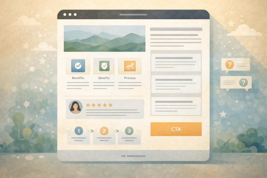
The core sections every small business service page should include
1. A clear hero section
The first screen should tell the reader what the service is and who it is for.
That usually means:
- a simple headline
- a short supporting line
- one primary call to action
- a supporting visual or trust cue where relevant
This is not the place for clever wording. Good website copy for small business is usually direct, specific, and easy to understand on the first read.
A weak hero says something like “Smart solutions for modern growth.”
A stronger hero says what the business actually does and who it helps.
For example, if you are a bookkeeping firm, web studio, therapist, electrician, or consultant, the page should make that obvious immediately.
2. A short problem and outcome section
Once the reader knows what the service is, the next step is helping them recognise their own situation.
This section should answer questions like:
- What issue does this service solve?
- What tends to go wrong without it?
- What outcome does the client want instead?
This is where conversion-focused web design begins to matter. The page should feel like it understands the buyer, not just the business.
3. What is included
A lot of small business service pages stay too vague.
A visitor should not have to guess what is actually included in the service. A simple bullet list or short breakdown can make a big difference.
This section can include:
- deliverables
- timelines
- optional add-ons
- what clients are responsible for
- what happens after enquiry
Clarity lowers friction.
4. Proof and trust
Good service page design for small business should include relevant website trust signals. These do not always have to be formal testimonials.
Useful trust signals can include:
- examples of similar work
- before-and-after outcomes
- industries served
- process clarity
- credentials or experience
- FAQs that address real concerns
If you do have a testimonial or mini case study that directly matches the service, this is where it helps most.
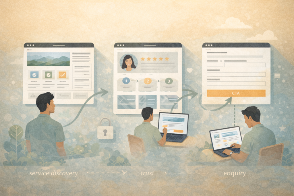
5. A simple process section
People are more likely to enquire when they understand what happens next.
A short “how it works” section reduces uncertainty. For example:
- Step 1: Initial enquiry
- Step 2: Review and recommendation
- Step 3: Delivery or setup
That kind of sequence helps the reader picture the experience, which supports a better website user journey.
6. A strong call to action
Every service page should have a clear next step.
That might be:
- book a call
- request a quote
- send an enquiry
- view packages
- ask a question
The page should not leave the user wondering what to do next. Strong call to action design is clear, visible, and matched to the level of buyer intent. Not everyone is ready to buy today, but most people are ready for one sensible next step.
How service page design supports SEO and leads
One reason service page design for small business matters so much is that these pages often carry both SEO and conversion responsibility.
A service page may be the page you want to rank for a service term, but it also needs to convert the visitor once they land there.
That means the page has to balance:
- keyword relevance
- useful structure
- buyer clarity
- trust
- action
This is where small business website SEO and UX need to work together instead of competing. Search engines reward helpful, well-structured pages, but users still need to feel confident enough to take action. Google’s guidance consistently points site owners toward clear, useful, people-first content rather than thin or vague pages.
If SEO is part of the plan, Search Engine Optimisation should be considered while the page structure is being planned, not after the design is already locked in.
Landing page vs service page: know the difference
This is a useful distinction.
The landing page vs service page question comes up often, especially when small businesses run ads or build new sites.
A landing page is usually designed for a single campaign or traffic source. It often removes most distractions and pushes one action.
A service page has a broader job. It needs to work within the website, support organic search, answer buyer questions, and still guide action.
That is why service page design for small business should not be treated like a stripped-down ad page. A service page often needs more context, more trust, and more substance than a campaign landing page.
A practical service page layout that works
If you want a reliable service page layout, this sequence works well for many service businesses:
- Hero section with headline, audience, and CTA
- Short problem and outcome section
- What is included
- Benefits or results
- Process or how it works
- Proof or trust section
- FAQ
- Final CTA
This structure gives the reader a natural path from awareness to action.
It also helps with website copy for small business because each section has a clear job. Instead of trying to write one perfect paragraph that does everything, you let the structure do part of the work.
Checklist: what to review before publishing a service page
Use this checklist before you publish or refresh a page.
- □ Is the service named clearly in the headline?
- □ Does the page say who the service is for?
- □ Is the main problem explained in plain language?
- □ Are the deliverables or inclusions visible?
- □ Is there at least one strong trust element?
- □ Is the CTA visible without too much scrolling?
- □ Does the page support a clear website user journey?
- □ Is the page written in plain, specific language?
- □ Does the page support small business website SEO without sounding forced?
- □ Is the mobile experience clean and easy to scan?
Common mistakes in service page design for small business
1. Writing the page like a brochure
Many pages describe the service but do not help the buyer decide.
They say what the business does, but not why that matters to the visitor.
2. Being too vague
This is one of the biggest issues in service page design for small business.
Words like tailored, strategic, premium, and bespoke are not enough by themselves. The page still needs specifics.
3. Hiding the CTA
A service page should not make people hunt for the next step. Good call to action design puts the next move in plain sight.
4. Skipping trust signals
Without website trust signals, the page asks the reader to take a leap too early.
5. Treating all services the same
Different services often need different emphasis. Some need more proof. Some need more explanation. Some need faster action. Strong small business service pages are tailored to the buying decision behind each service.
6. Ignoring mobile scanning
A page may look fine on desktop but feel exhausting on mobile. Short paragraphs, helpful subheadings, and clean sections matter.
How to write better website copy for small business service pages
The writing matters as much as the layout.
Good website copy for small business usually has these qualities:
- specific rather than generic
- clear rather than clever
- useful rather than padded
- buyer-focused rather than self-focused
A few practical tips:
Lead with clarity
Say what the service is in plain language.
Use the customer’s questions
Build sections around what people genuinely want to know.
Cut filler
If a sentence sounds polished but says very little, rewrite it.
Show the result
Do not just describe the service. Explain what changes for the client.
Match the CTA to intent
For some services, “Request a quote” makes sense. For others, “Book a discovery call” or “Ask a question” may work better.
That is where conversion-focused web design becomes practical rather than abstract. It is about helping real users make progress.
What changes for local service businesses
For a local service business website, a service page often needs a few extra signals:
- service area or location relevance
- practical trust cues
- fast contact options
- mobile-first readability
- a visible contact path
For example, a local accountant, plumber, designer, clinic, or legal consultant may not need a complex page, but they do need clarity and trust fast.
This is also where internal site support matters. Website Maintenance & Care can help keep forms, plugins, updates, and page performance in good shape once the site is live.
FAQ: Service page design for small business
What is the goal of a service page?
The goal is to help a potential client understand the offer, trust the business, and take the next step.
How long should a service page be?
Long enough to answer real questions and support action. Not every page needs to be long, but thin pages often underperform.
Should every service have its own page?
Usually yes, if the services are meaningfully different. Dedicated pages often improve clarity, SEO targeting, and conversion.
What is the difference between a landing page and a service page?
A landing page is usually campaign-specific. A service page is part of the wider site and often needs more detail, trust, and search value.
What matters most on a small business service page?
Clarity, trust, structure, and a visible next step.
How VVRapid can help
If your site already exists but your service pages are not doing enough, VVRapid can help refine the structure, messaging, and UX so those pages work harder. Website Design & Development is the main starting point, while SEO, content, and maintenance support can be layered in where needed. The aim is not to make pages longer for the sake of it. It is to make them clearer, more useful, and more likely to generate the right enquiries.
A sensible next step is to review your current service pages, compare them against this structure, and then explore Website Design & Development or contact VVRapid for support.