Mobile first website design for small business is no longer a nice extra. It is part of basic website usability. For many small businesses, the first visit happens on a phone, not a desktop, and that first impression often decides whether someone stays, enquires, or leaves.
Table of Contents
A site can look polished on a large screen and still feel frustrating on mobile. Buttons may be too small, sections may feel cramped, forms may be tiring, and the content that matters most may be buried too far down. That is why mobile-first thinking now affects trust, conversion, SEO, and the overall customer experience.
If you are building or refreshing a site, it helps to treat mobile as the starting point instead of the afterthought. That is where Website Design & Development becomes especially important, because the structure, layout, and page priorities need to work on smaller screens from the beginning.
Why mobile first website design for small business matters now
The core idea behind mobile first website design for small business is simple.
You design the experience for smaller screens first, then expand it for larger screens. This forces better decisions about what matters most, what should appear first, and what a user should do next.

For a small business, that is valuable because mobile visitors are usually looking for clarity fast. They want to know:
- what you do
- whether you are relevant to their need
- whether they can trust you
- how to contact you or take the next step
A cluttered mobile experience makes all of that harder.
A strong mobile-friendly small business website keeps the path short, clear, and easy to use. That matters whether the user is searching for a local service, comparing providers, or checking your site after a referral.
What mobile first really means
Many people assume mobile-first just means a site that shrinks down to fit a phone screen.
That is not enough.
Real mobile first website design for small business means thinking about:
- content priority
- button size
- tap targets
- section order
- navigation simplicity
- page speed
- form length
- readability
- visual spacing
In other words, it is not only about screen size. It is about use.
This overlaps with responsive website design, but the mindset is slightly different. Responsive design makes a layout adapt to different screens. Mobile-first design starts with the smallest practical experience and builds upward from there.
That difference matters. A site can be technically responsive and still offer weak mobile website UX if the content hierarchy and interactions are poorly planned.
Why small businesses feel mobile problems more sharply
Large brands can sometimes absorb a clumsy mobile experience because people already know who they are.
Small businesses usually cannot.
If your local business mobile website is slow, confusing, or hard to act on, users may simply go back and choose another option. There is often very little patience on mobile, especially when someone is comparing providers, standing on-site, commuting, or making a quick decision between tasks.
For small businesses, mobile friction often shows up as:
- fewer enquiries
- shorter visits
- form abandonment
- missed calls
- lower trust
- weaker search performance
That is why mobile first website design for small business should be treated as a business decision, not just a design preference.
The practical benefits of a mobile-first approach
1. Clearer content priorities
Designing for mobile first forces you to decide what actually matters.
That usually leads to:
- clearer headlines
- shorter sections
- better CTAs
- more focused page structure
This often improves the full site, not just the phone version.
2. Better conversion paths
Strong mobile conversion optimisation is often about reducing friction, not adding more persuasion. If the contact path is easy, the page feels trustworthy, and the next step is obvious, more visitors are likely to act.
3. Stronger usability
Good mobile website UX makes the site easier to scan, tap, read, and understand. That benefits both new visitors and returning ones.
4. Better support for local intent
A local business mobile website often needs to support quick actions like calling, getting directions, sending a message, or checking opening details. Mobile-first planning helps those actions stay visible.
5. Better alignment between UX and SEO
Search visibility and usability work together. Search Engine Optimisation matters more when the page people land on is easy to use on mobile too.
The mobile UX issues that cost small businesses leads
This is where mobile first website design for small business becomes very practical.
A lot of small business websites lose leads because of a few repeated issues.
Overloaded first screens
If the first mobile screen is crowded with menus, sliders, badges, and vague copy, users may not know what to focus on.
Weak mobile navigation design
A menu should help users move, not slow them down. Good mobile navigation design keeps labels simple and avoids burying important pages too deep.
Small tap targets
Buttons and links should be easy to tap without zooming or accidental clicks. This is a core part of touch-friendly design.
Forms that ask too much
Long forms often feel worse on mobile than they do on desktop. Strong mobile conversion optimisation usually means shorter forms, better field order, and fewer unnecessary inputs.
Poor mobile website layout
A weak mobile website layout may place important content too low, create awkward spacing, or make pages feel visually tiring. Good mobile layout design helps the visitor move naturally from question to answer to action.
Slow loading pages
Website speed for mobile matters because mobile users are often on less stable connections or multitasking. Heavy pages create friction quickly.
What to prioritise on a mobile homepage or service page
If you are trying to improve mobile first website design for small business, focus on essentials first.
A strong mobile page usually prioritises:
- a clear headline
- a short supporting line
- one visible CTA
- one main proof cue
- concise content blocks
- fast access to contact options
This is especially important for service businesses. A visitor on a phone is rarely in the mood to decode a page full of filler.
For many sites, the best move is not adding more content but improving the order and reducing the clutter. That is where a better mobile website layout usually delivers more value than visual flourishes.
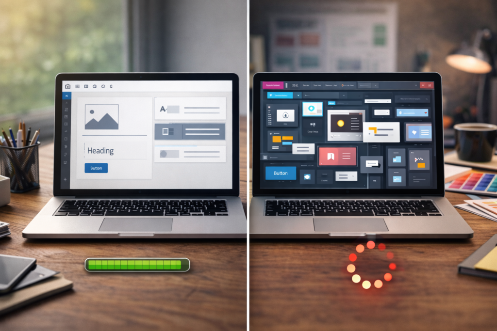
Responsive website design is necessary, but not enough
A lot of people think responsive website design solves the problem on its own.
It helps, but it does not solve everything.
A responsive site can still have:
- oversized content blocks
- weak CTA placement
- confusing menus
- poor reading flow
- frustrating forms
- too much scrolling before the key information appears
That is why mobile first website design for small business needs more than flexible grids. It needs content discipline and better UX decisions.
In practical terms, that means starting with the phone experience and asking:
- What does the user need first?
- What is the clearest next step?
- What can be removed?
- What must stay visible?
Checklist: how to review your site on a phone
Use this checklist to review your own site.
- □ Can a new visitor tell what you do within a few seconds?
- □ Is the main CTA visible early?
- □ Is the menu simple enough to understand quickly?
- □ Are the buttons easy to tap?
- □ Does the page support touch-friendly design?
- □ Is the text comfortable to read without zooming?
- □ Does the mobile website layout feel clean and well spaced?
- □ Are forms short and easy to complete?
- □ Is website speed for mobile acceptable on normal mobile data?
- □ Does the page support small business website accessibility with readable contrast, clear labels, and usable structure?
Common mistakes in mobile first website design for small business
1. Designing desktop first, then squeezing it down
This is still one of the biggest issues. Desktop layouts often carry too much content and too many visual elements into smaller screens.
2. Hiding key actions
Phone numbers, contact buttons, forms, or booking links should not be hard to find on mobile.
3. Treating mobile as a lighter version of the real site
For many visitors, mobile is the real site.
4. Ignoring accessibility basics
Good small business website accessibility helps more users complete tasks successfully. Clear labels, readable type, usable forms, and sensible contrast all matter.
5. Overcomplicating the menu
Weak mobile navigation design increases friction quickly. A small business site does not usually need clever navigation. It needs clear navigation.
6. Using long blocks of copy
Mobile users scan. If the page is dense, they are more likely to leave. Better sectioning improves mobile website UX immediately.
How mobile-first thinking improves conversions
Good mobile conversion optimisation is usually built on small practical choices.
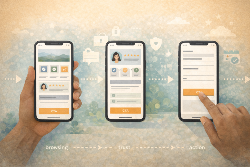
These include:
- one clear primary CTA per section
- shorter forms
- click-to-call where relevant
- stronger section order
- better spacing
- proof placed near decision points
For a small service business, this can make a noticeable difference. A person on a phone may be comparing three businesses in a row. If your page is easier to use, easier to trust, and easier to act on, that helps.
This is also where website speed for mobile and UX overlap. A site that loads slowly, jumps around, or makes the user wait before interacting loses momentum.
Mobile-first design and accessibility
Mobile first website design for small business should also support accessibility.
That includes:
- readable font sizing
- clear hierarchy
- usable forms
- tappable controls
- enough colour contrast
- avoiding interface clutter
Good small business website accessibility is not separate from good UX. In many cases, it is the same work seen through a wider lens.
For service-based businesses, this matters because accessibility helps more visitors reach the information they need without frustration. It also improves the overall quality of the site.
What to do if your current site is not mobile-friendly
If your site feels weak on mobile, do not assume you need a full rebuild immediately.
Start by checking:
- your top landing pages
- your homepage
- your main service pages
- your forms
- your menus
- your contact paths
You may find that a few focused changes solve a big part of the problem.
For example:
- rewrite the first section
- simplify the menu
- shorten forms
- improve button size
- reduce content clutter
- move the CTA higher
- improve loading performance
If the issues go deeper, then a larger redesign may be worth it. That is where Website Maintenance & Care can help with updates, plugin stability, and performance support while changes are being made.
FAQ: Mobile first website design for small business
What does mobile-first website design mean?
It means designing the website experience for smaller screens first, then expanding it for larger devices.
Is responsive design the same as mobile-first design?
Not exactly. Responsive design adapts layouts across screens. Mobile-first design starts with the mobile experience as the priority.
Why does mobile design matter so much for small businesses?
Because many visitors first encounter small business websites on phones, and they often make quick trust and action decisions there.
What is the biggest mobile UX mistake small businesses make?
One of the biggest mistakes is trying to shrink a desktop-first layout instead of rethinking the page for mobile use.
Do I need a full redesign to improve mobile performance?
Not always. Sometimes improving layout, content order, CTAs, speed, and forms can solve the main issues.
How VVRapid can help
If your site looks fine on desktop but underperforms on phones, VVRapid can help review the structure, layout, and conversion path with a more practical mobile-first lens. Website Design & Development is the main place to start, with SEO, hosting, maintenance, and broader digital support added where needed. The goal is not to overcomplicate the site. It is to make it easier for real users to understand and act on. VVRapid’s Websites & UX category itself highlights fast, clear, easy-to-use websites, mobile-first design, conversion-focused pages, and accessibility basics as core themes.
A sensible next step is to review the current site on a phone, note the friction points, and then explore Website Design & Development or contact VVRapid for support.