A conversion-focused website is designed around the actions that matter to your business, such as enquiries, bookings, purchases, calls or quote requests. Instead of treating your website as a digital brochure, it creates a clear path from a visitor’s first question to a useful next step.
Table of Contents
That does not mean filling every page with sales messages. Effective conversion-focused design combines helpful content, intuitive navigation, credible proof and well-timed calls to action.
For a small business, this distinction matters. A website can look modern, attract traffic and still generate very few website enquiries. The problem is often not the colour palette or the amount of traffic. It is the journey visitors are expected to follow.
What is a conversion-focused website?
A conversion-focused website is planned, written, designed and measured around specific business outcomes.
Those outcomes depend on the type of business.
For a consultant, the goal might be a discovery call. For a local service provider, it might be a phone call, WhatsApp message or quote request. For an online store, the primary goal is usually a completed purchase. A software company may prioritise demo bookings or trial registrations.
The important point is that the desired action is decided before the pages are designed.
A conversion-focused website should help a visitor:
- Understand what the business offers
- Decide whether the service is relevant
- Find answers to important buying questions
- Assess whether the business appears credible
- Understand what to do next
- Complete that action without unnecessary friction
A visually impressive site may support this process, but visual appeal alone is not a website conversion strategy.
Good small business website design connects presentation with purpose.
Businesses planning a new site can review VVRapid’s website design and development service for an overview of strategy, UX, design and development support.
What counts as a website conversion?
A conversion is a valuable action completed by a visitor.
The word “conversion” is sometimes associated only with online sales, but many small business websites do not sell directly through a checkout. Their conversions happen earlier in the buying process.
Examples include:
- Submitting an enquiry form
- Requesting a quote
- Booking an appointment
- Calling the business
- Starting a WhatsApp conversation
- Registering for an event
- Downloading a useful guide
- Joining an email list
- Creating an account
- Completing a purchase
Your primary conversion should reflect the most valuable realistic action a website visitor can take.
Secondary conversions can indicate interest without representing a complete sale. These could include viewing a pricing page, downloading a guide or clicking through to a booking platform.
Google Analytics lets businesses identify important actions as key events, which can then be used to understand whether visitors are completing meaningful steps.: Source: Google Analytics Key Events ↗
The aim is not to track everything simply because it can be tracked. Focus on actions that help you make better decisions.
A conversion-focused website starts with one clear objective
Many underperforming websites have too many competing objectives.
The homepage might ask visitors to call, subscribe, download a PDF, browse the blog, follow social media accounts, watch a video and request a quote. When every action is presented as equally important, the visitor has to decide what the website itself has not decided.
Start by defining one primary website objective.
Ask:
What is the most useful next step a qualified visitor can take?
A professional services firm might choose “Book a consultation.” A construction company might choose “Request a quote.” A restaurant might prioritise “Book a table.”
Other actions can remain available, but they should not compete visually with the main website call to action.
This creates a clearer hierarchy and makes the user journey design easier to plan.
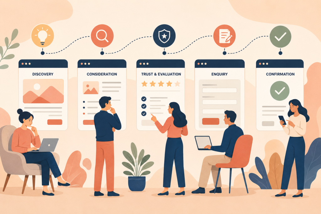
How a conversion-focused website guides the buyer journey
Not every visitor is ready to contact you immediately.
Some people are only identifying a problem. Others are comparing providers, reviewing prices or checking whether your business works in their area. A conversion-focused website supports these different levels of buyer readiness.
Early-stage visitors need clarity
An early-stage visitor may be asking:
- What does this service involve?
- Is this the right solution to my problem?
- What should I expect?
- Are there alternatives?
Helpful articles, service overviews and explanatory content can answer these questions without forcing a premature sales conversation.
Comparison-stage visitors need decision support
A visitor who is comparing options may want:
- Clear service inclusions
- An explanation of the process
- Relevant examples
- Pricing guidance, where appropriate
- Frequently asked questions
- Information about timelines
- Evidence of experience or capability
This is where commercial investigation content becomes valuable. It helps a buyer assess fit instead of relying on vague promotional claims.
Decision-stage visitors need an easy next step
Once someone is ready to act, the process should be simple.
The call to action should be visible. The form should ask only for information that is genuinely needed. Contact details should be easy to find, particularly on mobile devices.
The path should feel obvious rather than clever.
7 elements of a conversion-focused website
1. A clear value proposition
Visitors should quickly understand:
- What you offer
- Who it is for
- What problem it addresses
- Why they should continue reading
Avoid opening with broad statements such as “Welcome to our website” or “We deliver excellence.”
A stronger opening describes the service and its relevance in plain language.
2. Simple website navigation
Navigation should help visitors move towards useful information.
Use familiar labels such as Services, About, Pricing, Resources and Contact where they accurately describe the destination. Creative labels can sound distinctive but make visitors work harder.
Good navigation is especially important on mobile, where space is limited and website calls to action can easily disappear inside a crowded menu.
3. Pages matched to visitor intent
Each important service should have enough space to answer its own buying questions.
A single general services page may be suitable for a very small site, but businesses with several distinct services usually benefit from dedicated pages. These pages can address specific needs, explain the process and direct visitors to the right next step.
This also supports search visibility because each page can target a clearer topic.
VVRapid’s search engine optimisation service can help connect website structure, content and search intent.
4. Useful and specific content
Conversion-focused design depends heavily on content.
A polished layout cannot compensate for vague descriptions. Visitors need concrete information about deliverables, suitability, processes and expectations.
Useful content may include:
- Who the service is designed for
- Problems it can help solve
- What is included
- What is not included
- The process from enquiry to delivery
- Likely client responsibilities
- Common questions
- Relevant next steps
Google’s SEO guidance recommends creating useful, well-organised content for people rather than producing pages mainly to manipulate search rankings.: Source: Google Search Central SEO Starter Guide ↗
5. Credible trust signals
Trust signals reduce the uncertainty involved in contacting an unfamiliar business.
Depending on the business, these may include:
- Genuine customer reviews
- Relevant qualifications
- Industry memberships
- Clear contact information
- An informative About page
- Secure payment information
- Transparent policies
- Work examples
- A clearly explained process
Use real proof only. Generic badges, invented statistics and unsupported claims can weaken credibility rather than improve it.
6. Well-timed calls to action
A website call to action tells visitors what they can do next.
Common examples include:
- Request a quote
- Book a consultation
- View available packages
- Check availability
- Start your order
- Speak to the team
The wording should set a clear expectation. “Submit” describes what happens to a form, but it does not explain the benefit to the visitor.
Calls to action should appear where a visitor may reasonably be ready to proceed, such as after the service explanation, process, pricing guidance or FAQ.
They should not interrupt every paragraph.
Think: visible, relevant and proportionate.
7. Low-friction forms
Forms are a common failure point for a lead generation website.
Every additional field creates another decision. Long forms may be justified for complex quote requests, but a first-contact form often needs only:
- Name
- Email or phone number
- Service required
- A short project description
Form labels should be clear, error messages should explain what needs correcting, and the form must work on mobile devices.
Accessible website forms also need visible labels, sufficient colour contrast and sensible keyboard navigation. The Web Content Accessibility Guidelines provide an international reference for accessible digital experiences.: Source: W3C Web Content Accessibility Guidelines ↗
Conversion rate optimisation is not just button testing
Conversion rate optimisation is often reduced to changing button colours or testing different headlines.
Those experiments can be useful, but only after the larger problems have been addressed.
A more practical order is:
- Confirm the right visitors are reaching the page.
- Check whether the offer is clear.
- Make sure the page answers important buying questions.
- Remove technical and usability barriers.
- Verify that forms, calls and checkout steps work.
- Measure meaningful actions.
- Test focused improvements.
A confusing offer will not be fixed by a brighter button.
Similarly, increasing traffic before fixing the website conversion strategy can simply send more people into a weak journey.
How to measure whether the website is working
Measurement should connect website activity with business results.
Useful metrics may include:
- Qualified enquiry submissions
- Appointment bookings
- Phone or WhatsApp clicks
- Product purchases
- Checkout completion rate
- Quote requests
- Cost per lead
- Enquiry-to-client rate
- Conversion rate by landing page
- Conversion rate by traffic source
Avoid judging performance through page views alone. More traffic is not always better traffic.
For example, a website may receive fewer visitors after improving its search targeting but generate more qualified website enquiries. That can be a positive outcome.
Measurement also needs context. A high enquiry count is less valuable when most enquiries are irrelevant. Lead quality, sales outcomes and customer fit should form part of the review.
Conversion-focused website checklist
Use this checklist when planning or reviewing a business website:
- □ The website has one clearly defined primary conversion.
- □ The homepage explains what the business offers.
- □ Each core service has a clear destination page.
- □ The primary call to action is easy to find.
- □ Calls to action match the visitor’s stage of awareness.
- □ Navigation uses understandable labels.
- □ Important pages work well on mobile devices.
- □ Contact forms ask only for necessary information.
- □ Form submissions have been tested.
- □ Phone, email and WhatsApp links work correctly.
- □ Service descriptions answer real buying questions.
- □ Genuine trust signals appear near decision points.
- □ Important pages load quickly.
- □ Accessibility basics have been considered.
- □ Meaningful actions are tracked in analytics.
- □ Results are reviewed using lead quality as well as quantity.
- The site has a process for ongoing maintenance and improvement.
Common mistakes that reduce website enquiries
Designing before defining the goal
Without a primary objective, design decisions become subjective. The team debates colours and layouts without agreeing on what visitors should accomplish.
Define the conversion first.
Writing for the business instead of the customer
Company history has a place, but it should not dominate every page.
Visitors are usually trying to determine whether you understand their problem and can provide a suitable solution. Lead with relevance, then support it with credentials.
Using one call to action for every visitor
“Buy now” may be suitable for a ready customer but too strong for someone researching a complex service.
Offer appropriate next steps, such as viewing the process, comparing packages or requesting an initial conversation.
Hiding important information
Some businesses remove prices, processes and service details because they want visitors to contact them.
This can work against conversion. Buyers may leave because they cannot determine whether the business is a realistic option.
Not every company can publish fixed prices, but it can still explain what affects scope and cost.
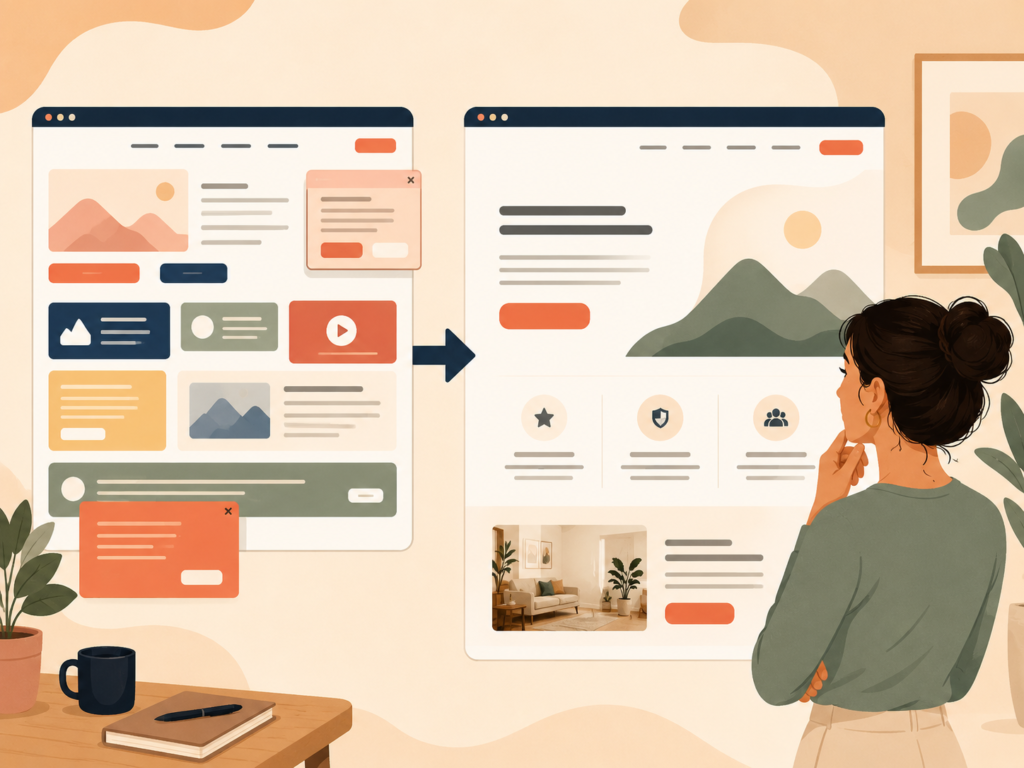
Adding too many visual distractions
Movement, pop-ups, sliders and competing buttons can weaken the page hierarchy.
Every design element should support understanding, trust or action. If it does none of those things, question whether it needs to be there.
Ignoring mobile users
A desktop layout can appear excellent while the mobile version hides the call to action, makes forms difficult to use or creates oversized blocks of text.
Test the complete conversion journey on a real phone.
Failing to maintain the site
Broken forms, outdated plugins, expired information and slow pages quietly reduce trust.
Ongoing website maintenance helps protect the journey after launch. VVRapid’s website maintenance and care service covers routine technical support and website upkeep.
Do you need a complete redesign?
Not every conversion problem requires a new website.
A focused improvement may be enough when the platform is stable and the underlying structure is sound.
Possible improvements include:
- Rewriting the homepage introduction
- Clarifying service positioning
- Simplifying the main navigation
- Improving calls to action
- Shortening an enquiry form
- Adding missing trust information
- Creating dedicated service pages
- Fixing mobile usability issues
- Improving tracking
A redesign becomes more reasonable when the site has deep structural, technical or brand problems that cannot be addressed efficiently through smaller changes.
The decision should be based on evidence, not simply the age of the website.
FAQ: conversion-focused website design
Is a conversion-focused website only for ecommerce businesses?
No. Service businesses, consultants, local companies, charities and membership organisations can all use conversion-focused design. The desired action may be an enquiry, booking, donation, registration or phone call rather than a purchase.
What is a good website conversion rate?
There is no universal rate that suits every website. Results vary by industry, traffic source, offer, device, price point and type of conversion. Compare performance against your own baseline and focus on qualified outcomes rather than an isolated benchmark.
Can SEO and conversion-focused design work together?
Yes. SEO helps suitable visitors discover the site, while conversion-focused design helps them understand the offer and take the next step. Strong results usually require both relevant traffic and a clear user journey.
How many calls to action should a page have?
A page can repeat the same primary call to action at sensible decision points. It may also include a lower-commitment secondary action. Avoid presenting several unrelated actions with equal visual importance.
How often should a conversion-focused website be reviewed?
Review important journeys after launch, after major marketing changes and whenever lead quality or conversion performance changes. Forms, tracking and calls to action should also be checked regularly.
How VVRapid can help
VVRapid plans and builds websites around clear business goals, useful content and practical user journeys. Support can include website structure, UX, visual design, WordPress development and ecommerce functionality. SEO, hosting and ongoing website care can be added where the project requires them. The process starts with understanding what visitors need to find, believe and do. This creates a more useful foundation than designing pages without a defined conversion goal.
A good conversion-focused website does not pressure every visitor. It removes uncertainty, answers useful questions and makes the next step easier.
View the VVRapid Website Design & Development service to explore options for a new website or structured redesign.